
The ingredients 🍉
The brief
Individual concept project to create a microsite that will help Waitrose customers plan and manage their meal ingredient purchases more efficiently.
Time and team
- 2 weeks
- Just me :)
My role
This was an individual project so I carried out all aspects of the research, design and testing.
Skills and tools
- Competitor analysis
- Card sorting
- Site map and navigation schema
- Interface design
- Rapid prototyping
- User testing
The quest 🌴
Discovery

Persona driven user journey through a competitor's site
Due to a lack of time, many Waitrose customers are reducing the number of home cooked meals they make. Work and family commitments mean that they plan poorly when purchasing food, which in turn, results in them throwing away spoiled food. The Waitrose customers want a way to get inspiration for meals, plan meals, and purchase only the food they need for those planned meals, all in one place.
In order to create gain a better understanding of how Waitrose could really help its customers in the meal planning scene, I analysed competitor sites to see how they enabled their users to fulfil certain tasks. I found that, though some sites did some things very well, none of the sites did everything well. There were “pain points” along a customer’s journey that gave me a clear idea of the areas where the Waitrose site could really differentiate itself.
Vision and hypothesis
My hypothesis for the microsite was that a recipe and meal centred microsite that also enables delivery, will help people plan meals more effectively and enjoyably than a general grocery store. I used this hypothesis to guide my design and then to test the success of the prototype.
Design
With the pain points in mind, (namely, complex navigation, long flows to get anything done, and a lack of flexibility and simplicity regarding meals) I went about designing and testing what information should be included in the site and how it should be labelled. I used a series of open and closed card sorting exercises to define the information architecture of the site, formulating the site map. The card sorting was a crucial part of the process as, due to the site being e-commerce, there was a lot of information which needed to be structured in a clear and logical way.
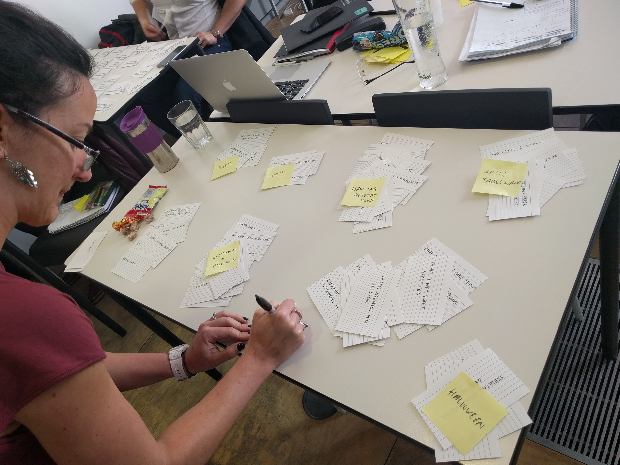
Card sorting exercises

Sitemap sketch
A strong and simple foundation site map and navigation schema meant that I was able to develop flexible user flows, thinking about the choices that a user may want to make when using the microsite.

Draft user flow
These flows concentrated on the steps that a typical time poor user would have to take in order to complete 4 basic activities on a site: Choosing meals, reordering a previously ordered meal, amending basket contents, and checking out. Knowing our user’s pain points, and what they needed to do, I then listed the minimum number of different page types, and made a low fidelity wireframe prototype of the microsite to test.
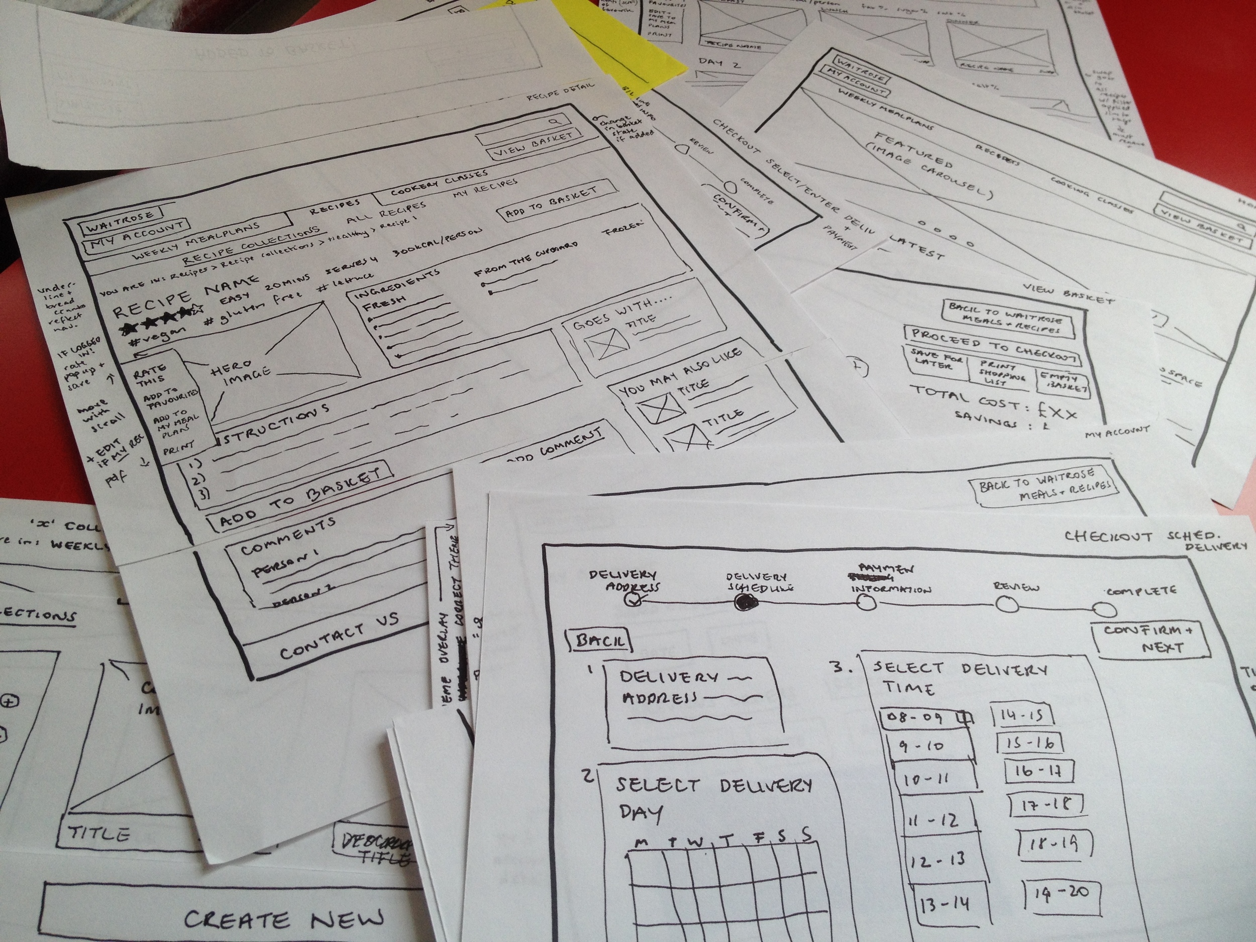
Low fidelity wireframe sketches
Testing
“I always knew exactly where I was… I had no questions at all about where I was or how to get somewhere else…”
The paper prototype was tested with several users and amendments were carried forward into mid fidelity digital wireframes. The digital wireframes were stitched together into a clickable prototype that was then tested further. The testing as a whole revealed some interesting findings, for example, testers really appreciated the navigation design.
The ability to upload personal recipes was considered a great advantage compared to competitors and the design of the checkout flow, (that included a guest checkout option), was deemed a success.

User testing
The initial testing demonstrated that users were really receptive to the idea of a Waitrose recipe centric microsite. It also demonstrated that the basic functionality in the prototype is fairly robust. There were however, areas where testers had suggestions for improvements.
The refinement 🌺
Iterations
There were three key areas of the latest tested prototype that testers said could be improved. Interestingly, the suggestions were all related to the labelling of “micro” elements on a page, perhaps implying that that the broader structure and layout was sufficiently intuitive that they were able to now focus on these smaller elements.

The basket review page
The basket review page was perhaps the page that could be most improved from further work. Testers suggested that tool tips could perhaps clarify what some of the icons meant, (e.g. “I’m not sure what this big plus sign is for…” ) and that they needed additional labelling of elements such as quantities of items in the basket.
Labelling on some of the filter functionality was also highlighted. For example users suggested explicit labelling of the fact that the filter bar scrolled with the page. Values for price and time sliders were also queried.
Though the checkout process was very popular, testers said it could be even better if the “next” and “back” buttons also appeared at the bottom of the page.

One of the checkout screens
“I’d like to see the buttons near the bottom of the page as well as at the top, especially if I was entering new information.”
The evolution 🍍
“Yes I’d use this… I normally browse for ideas and recipes on my phone first, and then have my laptop open when I’m doing the actual cooking…”
When asked if and when they would use the microsite, all testers said that they thought they would be likely to use the site, during the weekend when they had some time. Interestingly however, one tester suggested a new area for exploration that I had not previously considered, browsing recipes on their smart phone.
This statement suggests that, perhaps in future, a mobile version of the site could be explored for people who would like to browse the recipes and meal plans while they are out and about.

Explore other projects

TED – ASK ME ANYTHING
A group project extending the TED experience to include the ability for users to ask thought leaders questions in an “Ask me anything” format across both desktop and mobile platforms.

NOMNOM INSIGHTS
Working in an agile team of four, we ran user research along with design and continuous user testing in order to iteratively build a new onboarding experience for this software startup.