
The ingredients 🍉
The brief
A concept project extending the TED experience to allow people to ask leaders questions in an “Ask me anything” format.
Time and team
- 2 weeks
- Annelise Nelson
- Dorota Kacejko
- Jonathan Wump
- Niki Morariu
My role
As well as working on all of the deliverables with the team, I drew out our interfaces, developed the narrative for our presentation and helped keep us all on track!
Skills and tools
- User interviews
- Affinity mapping
- Persona design
- Feature analysis
- Design studio
- Usability testing
The quest 🌴
Discovery

Example of a text-based AMA on Reddit
TED is a global community, welcoming people from every discipline and culture who seek a deeper understanding of the world. TED’s agenda is to make great ideas accessible and spark conversation. With the growing popularity of AMA (ask me anything) style interviews on Reddit and elsewhere, we were tasked with introducing an AMA service to the existing online TED experience.
TED is famous for the quality of its expert content and for its live events and videos. However, our competitor analysis revealed that most AMAs are currently only text based and hosted by anyone, not exclusively experts. For that reason, many existing AMAs are “open” for long periods of time and the interview subject isn’t overwhelmed by an overload of questions. What these competitors did well was allow users to vote for questions and answers and also suggest similar questions to reduce the number of duplicate questions. Where there was a “live” or “video” element, competitors grouped the events as past or upcoming to facilitate searching. Users were encouraged to enter their questions in before the event and sometimes a moderator was present.
Interviews with TED users
Our user interviews revealed that voting for questions was generally a well regarded method for improving the quality of questions being asked. Interviewees were however skeptical about moderators as they felt they introduced bias and didn’t embody the “ask me anything” ethos. Our interviews also highlighted two main challenges specific to the brief. They highlighted that it was often incredibly difficult to connect with or contact a high profile thought leader, and consequently, it was very challenging to ask that thought leader a question.
Vision and hypothesis
As a team, we analysed the behaviours, goals and attitudes of our interviewees, and created an affinity map to help identify trends that could help guide our design process.

Affinity map of behaviours, goals and attitudes found in interviewees

We developed three personas from our user interviews
The trends were used to make example characters that represented our target users; we had “Paul” a “passive optimist”, “Marsha” a “pessimistic taker” and “Bradley” a “sharing contributor”. We concentrated on the “passive optimist” character “Paul” for this iteration because he valued expert input the most.
With our character in mind, we analysed the the tasks involved in finding an AMA session, asking a question in an AMA session, voting for a question and seeing the expert’s responses. Knowing our user’s journey through our site, and the business goals of the project, we prioritised functions and features to take into the design phase. Our hypothesis for the TED AMA service was that:
By providing Paul with the ability to ask a thought leader any question, Paul will:
- Be able to connect with more thought leaders
- Be able to ask those thought leaders the questions he cannot find answers to elsewhere
- Interact with a wider network of interesting people
- Ultimately be inspired by those thought leaders and learn from their experiences and stories
Design

Design studio
Design Studio
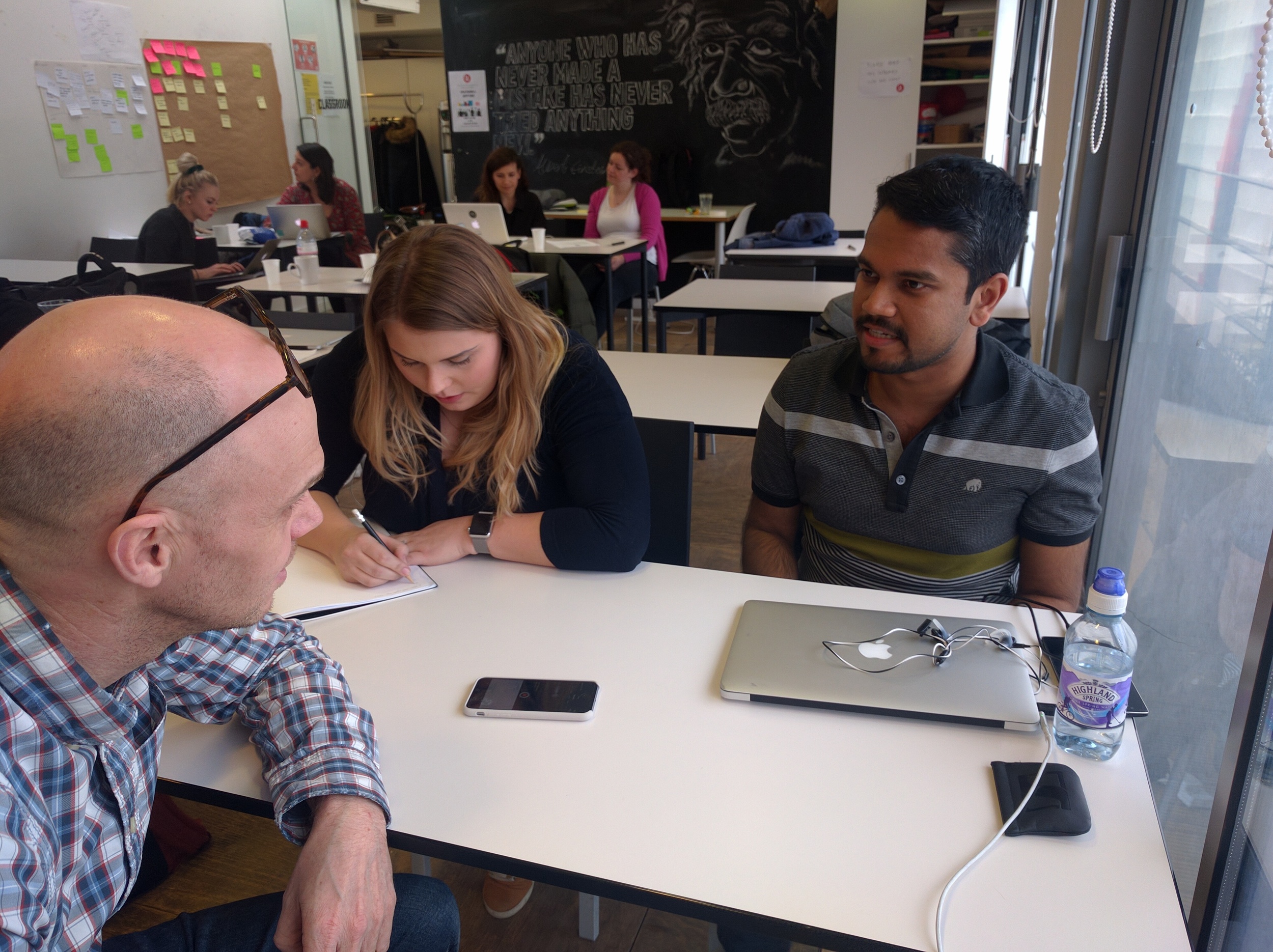
After prioritising feature ideas, and, to generate multiple solutions fast, we conducted a design studio. This involved the team all sketching as many versions of the key screens as possible in a set amount of time. We worked individually and in silence, before coming together to review the designs and jointly sketching out each interface based on everyone's input. This is a powerful and efficient way of designers collaborating to get interesting and quick results.
In our design studio, our whole team started ideating how our most complex screen would look on a mobile device. We started on mobile to enforce the most spatial constraints and to ensure our interface was as simple as possible. The output of the workshop was used as the basis for our first complete set of sketches. The whole team then tested the mobile paper sketches to gather usability feedback before I converted the mobile designs into desktop sketches. We developed our sketches into mid-fidelity digital wireframes using Omnigraffle and then created a clickable prototype in Invision ready to test.

Sketches of mobile interfaces

Sketches of desktop interfaces
Testing
We used our hypothesis to test both TED’s initial premise for a microsite, and also to test the success of the mid-fidelity prototype. User testing confirmed that the premise for the project was well received and provided us with three key areas where we could iterate our design.
Our initial grouping of AMA events into two groups, “Active” and “Past” was not clear to users so we split the events into three groups, “Past”, “Active now” and “Upcoming”.
“If an event is happening now, it’s not upcoming so... where do I go?”

Screen iteration following testing
Original notifications were for confirmation only but users wanted these to work a bit harder for them. So we added extra information to those notifications and added actions like “adding event to calendar” and "send me confirmation email".
Our original voting design was also quote overwhelming with stars, arrows and hashtags all appearing at one stage. So we stripped the voting design right back.

User testing

A heat map of testers' pain point helped us visualise trends
The refinement 🌺
Visual design
Having iterated our mid fidelity designs based on the feedback we received, we then went on to create high fidelity designs for both desktop and mobile in Sketch. We’d like to use these to get richer feedback from user testing and to test the effectiveness of different icon variations, particularly around voting and tagging of questions and answers.

High fidelity desktop screens

The evolution 🍍

High fidelity mobile screens
The area that most confused our testers was actually the labelling of TED’s global navigation system. So, if there were a next sprint for this project, we’d like the opportunity to visit that. The current labels of “Watch”, “Discover”, “Attend” and “Participate” seemed interchangeable and so users were not easily able to find the AMA events. This may also be because AMAs are a new format that you both watch, attend and participate in! That being the case, it may be that we’d need to revisit our information architecture and add AMA’s as a new global element.
By highlighting their desire not to miss an AMA event they’d registered for, users inspired an idea within the team to perhaps integrate with calendar service providers. If the TED AMA events are going to be a desirable event that people will pay and register for, then users would want a reminder in their existing digital calendars.
Lastly, as a team, we felt that future iterations could go back to the needs of our other identified characters, such as the “sharing contributor”. Those characters may want to answer questions related to an AMA event after that event has passed.

Explore other projects

SHARE A SHOW
A concept mobile movie app with a touch of class. Aimed at sophisticated cinema-lovers who want to make sure they watch movies together, this app allows users to tag and share movies of interest.
WAITROSE MEALS
A concept project to create a meal planning microsite for Waitrose allowing customers to plan single and weekly meals, and then purchase the ingredients necessary directly from Waitrose.